
Vera is a Specialist in Robotic Surgery and holds a PhD in Computer Vision and Machine Learning. She started VatiaTech to present the AI field clearly, intuitively and visually, addressed to students, engineers, scientists, developers or anyone interested in learning and understanding the emerging industry of Artificial Intelligence.
Brief
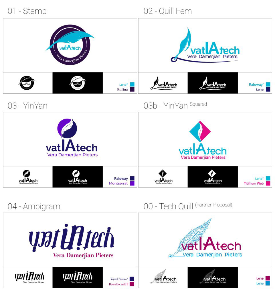
Vera already had an idea of how the logo would look and feel like. She wanted to use AI tech elements, like a digital quill, network lines & dots, in purple and blue variations and with Lena or similar fonts. The brand name was styled vatIAtech, as a combination of 3 elements: Vatia + IA + Tech
• Vatia, meaning Deep in Greek, a reference to Deep Learning,
• IA, are the initials of Intelligence Artificielle, French for Artificial Intelligence, the blog’s language,
• Tech, the known short name for technology.
• IA, are the initials of Intelligence Artificielle, French for Artificial Intelligence, the blog’s language,
• Tech, the known short name for technology.
Drafts
After researching AI, deep learning and future technology branding, with a combination of Vera’s references, I ended up 6 drafts, that blended the desired colours and font pairs.
Samples
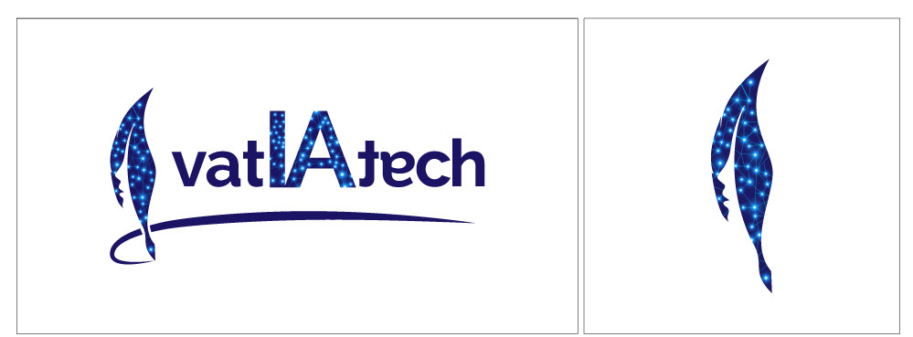
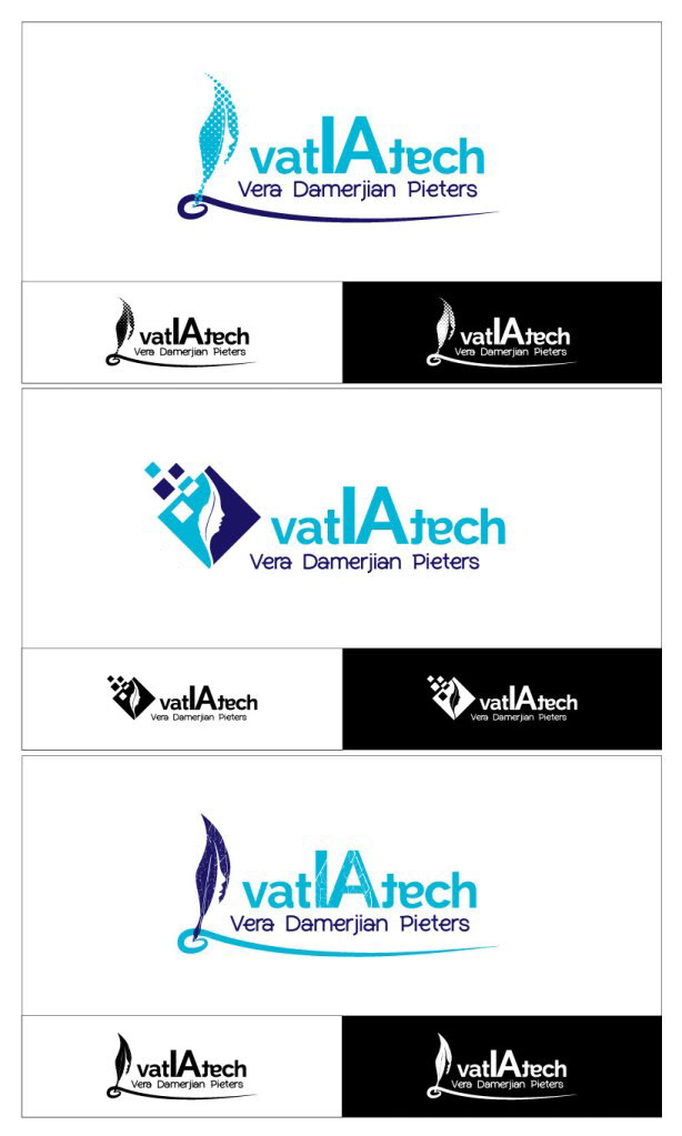
Vera was very excited about draft 02, in which I added the detail of a woman’s face-line within the quill, effectively symbolizing a female author. Further instructions were to add tech elements, like network lines and dots, as in draft 00, the colour pairs of navy blue and purple shade and font pair Raleway & Lena (Raleway letters ‘te’ in ‘tech’ were modified). The results were the below refined samples.
Final
From here on the selection was easy; a combination of the first with the last samples, with minor changes in quill direction, author’s name, colours and underline, lead to the final logo and related icon.